5 Helpful Tips for Using Animation in Mobile Site Design

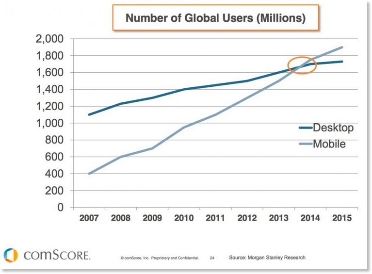
These days, people are more likely to use their mobile devices than their computers to access content. Whether it’s reading a blog, watching a video, paying bills, or any other activity one typically does online, it’s far more likely to be done on a smartphone or tablet than a desktop or laptop.
Since so many people rely on mobile, marketers have spent a great deal of time and money attempting to figure out a mobile marketing strategy, and develop websites and content that is well suited to mobile devices and a good user experience.

The Animation Trend and Mobile
Animation has quickly become one of the fastest-growing trends in web and content design. From animated explainer videos that give customers important information about your company in an entertaining way, to animated feedback that helps them navigate your site (such as animated forms or links to help direct them to certain actions), adding an animated, interactive element to your site is proven to help capture attention and increase conversions.
And it only makes sense. Animation is entertaining, it can be fun, it’s easier than ever before to incorporate thanks to easy animation makers, and it is proven to increase engagement and conversions. Illustrations tap into the innate form of symbolic communication that’s embedded deep in everyone’s brain. This is what makes animation so powerful.
There’s just one problem, though: often, when animation is designed for mobile, it doesn’t always work as intended. Mobile users have certain expectations for how things will work and appear on their devices, and when that doesn’t happen, they get frustrated or become disengaged. That’s why, when you are developing animations for mobile, you need to keep in mind the human experience, and ensure that you are using animations appropriately and correctly.
Tips for Making Mobile Animations Work
So what do you need to do? As you work on mobile-friendly animations, keep the following in mind.
1. Use animation sparingly
It can be tempting to include animation just because it’s cool, and you know that it gets attention. However, it can have the opposite effect and annoy people if it’s just there to be fancy and doesn’t really add to the user experience.
Don’t bog down the user experience with a long animated video or complex transitions that make things take longer than they should. Your animation should have a purpose (more on that in a moment) and add to the experience, not detract from it.
2. Animation needs a purpose
Why are you including the animation? There are several different ways to incorporate animation; you don’t need to use them all, but choose those that make the experience of navigating your site or application easier or more efficient.
For example, you might use animation to provide feedback, so that when the user does something (like click a link or fill out a form) the animation responds and shows them what happens next. Other ways you might include animation are the following:
- Assisting with navigation. Animating the navigation menu, for example, can help users find what they are looking for more easily, without cluttering the mobile space.
- Showing how the system works
- Adding fun or interest to the site or app. Without overshadowing the content or taking too much time.
- Showing how elements of the site are connected. For example, clicking on a menu icon and having the menu appear from that icon, clearly showing the connection between the elements.
See the Pen Simple JS mobile navigation by Kieran Hunter (@kieranfivestars) on CodePen.
- Providing a visual guide as to what to do next
3. Clutter Is the Enemy
While clutter is unwelcome on a desktop screen, it’s even more hated on a mobile screen. Again, animation needs a purpose, otherwise it runs the risk of adding to clutter on the screen and making it more difficult for users to engage with your site.
4. Keep User Expectations in Mind
Users of specific devices have unique expectations when it comes to how things will appear on their screens and how they will interact with their devices. In other words, when they tap their screen or scroll in a certain way, they expect the device to respond accordingly.
If your animation doesn’t respond within those expectations, it feels jarring and even unpleasant. Therefore, any animated elements that you include in your mobile design must be developed with user expectations at the forefront.
5. Have Fun
Animations are supposed to be fun, so have fun with them. Be creative, be unexpected, and add something that your users will enjoy. Just keep it functional, and avoid adding it just because it’s trendy right now. It will stand out — and not in a good way.
Building your website for mobile compatibility is important. Being mobile-friendly doesn’t mean you have to make your site overly simple or boring, though. If you remember these points, you can add animations to your mobile site and capture the best of both worlds, while still surprising and delighting your audience.


